Lee
Basnight
Trane Technologies
Internal AI knowledge search for company-wide access
Trane has decades of product, protocol and systems knowledge, scattered across every internal system the company owns. Every employee and every new hire is supposed to be able to reach all of it. The old keyword search handed you documents; people needed answers. I helped design the internal AI search tool that closed that gap. Two architectural approaches, both wireframed, both tested with real users, then we shipped the one that matched how people actually work. Underneath all of it, I built the information architecture that made the whole knowledge base retrievable in the first place.
- Two architectural approaches, both wireframed, both put in front of product, engineering and brand before anyone picked a favorite.
- An information architecture that maps the entire product, protocol and systems knowledge base into something a machine can actually retrieve.
- UX flows built for two very different humans: the new hire on day one and the tenured engineer.
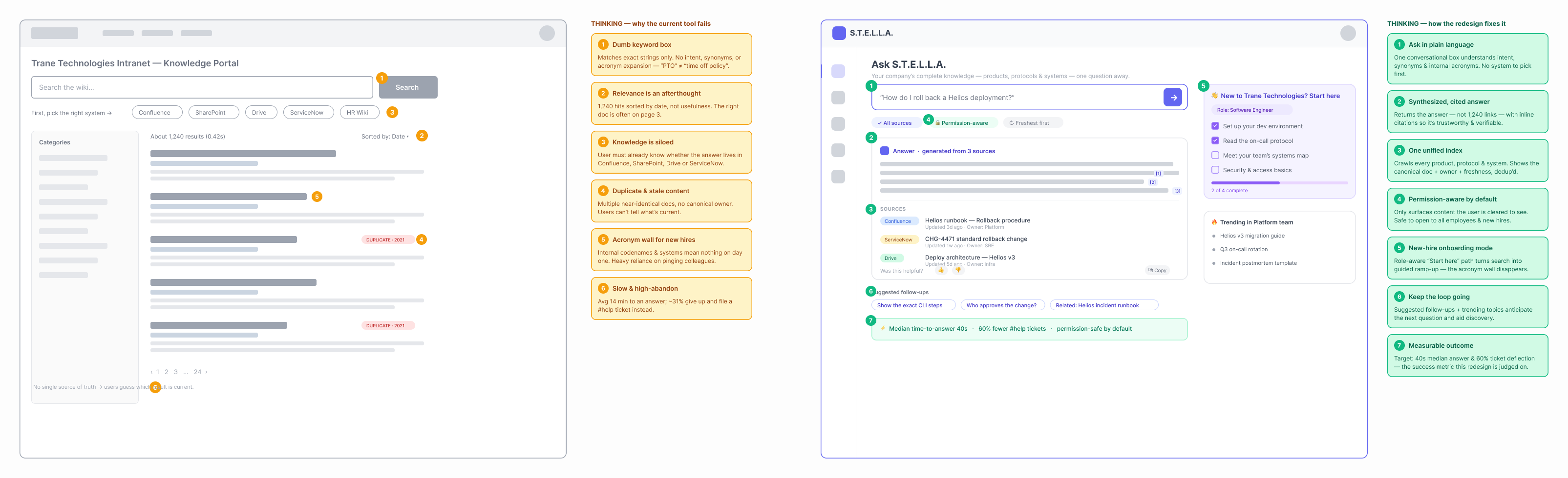
Wireframes. The legacy keyword search on the left, marked up with every place it breaks down for you. The redesigned answer view on the right, marked up with the calls that fix it.
The Problem.
Decades of product work leaves a mountain of documentation behind it. Trane's version lives across several systems. The old search only helped if you already knew which document you were hunting for. If you knew, great. If you didn't, you were guessing your way through over a thousand results sorted by date. New hires spent their first weeks just learning where to look; the real knowledge came later, if it came at all. The tenured folks were no better off, running the same lookups over and over for facts that should take one step to find. So the question became simple. Can a search tool just answer the question you actually asked and hand you the sources to back it up? That was the objective.
My Role & Scope.
I came in as the AI Content Designer on the tool. The information architecture was mine to own, so how every piece of product, protocol and systems content got organized for a machine to find, that was my call. I designed the two architectural approaches, wireframed both, ran them through cross-functional review with product, engineering and brand, then stayed on the winning direction all the way to ship. The retrieval engineering and the model infrastructure sat with the engineering org; my lane was the architecture, the flows and the design logic that made the whole thing usable.
Approach.
Architecture first, interface second. Before touching a single screen, I looked at what people were actually searching for. It was questions. Real questions in plain language, the way you'd ask a coworker. So I mapped those questions back to the way the knowledge is really structured, the products, the protocols, the systems, then designed two honestly different takes on how you get from a question to an answer. Both got wireframed. Both got tested, with new hires and with people who had run these systems for years. Then the testing picked the winner. I walked in with two real options and let the evidence make the call.
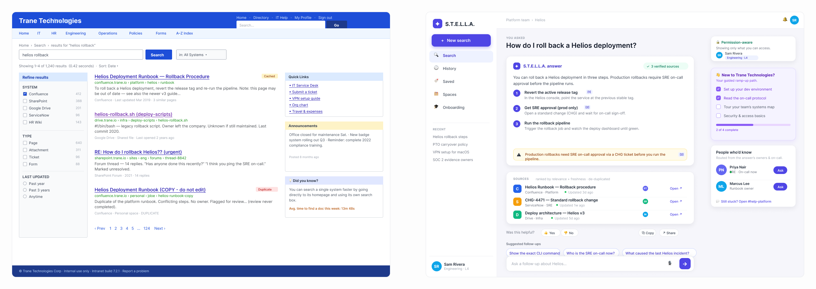
High fidelity. The old Trane intranet portal on the left, the new answer experience on the right.
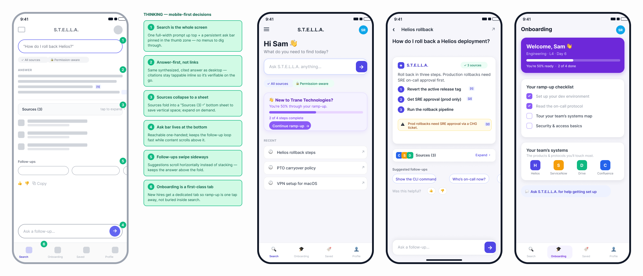
Mobile, built thumb-first. The ask bar sits where your thumb already is. The answer comes before anything else. New hires get their own onboarding tab a single tap away.
Key Decisions & Rationale.
- Two real approaches, both on the table, both with a genuine shot. Approach A kept the results-first layout everyone already knows and made it smart underneath, so semantic understanding pushed the right document to the top. Approach B threw the results list out and went fully conversational, handing back a written answer with its citations attached. Why build both? Because putting two live options in front of people forces an honest read on what they actually reach for. Both were defensible. The only question that mattered was which one matched how people really behave.
- The information architecture follows the way people actually think. Employees live in the products they touch and the protocols they run; that is the map already in their heads. The original docs were filed by document type and by the department that produced them, which works beautifully for that department and fails everyone else. So I rebuilt the whole thing around the user's mental model. A tool that files knowledge by who authored it falls apart fast, because the person searching has no idea who authored anything. They just know what they are trying to get done.
- Sources sit up front, as a headline feature. Every answer the AI gives shows exactly where it came from, one tap away from the original. This is why that matters: enterprise search lives or dies on trust. Trust is fragile. One wrong fact with no way to check it and people quietly stop believing the whole tool. Put the sources right there on the answer and every response is something you can verify on first read. That is what keeps people coming back.
- The answer works on three confidence levels. High confidence gives you a straight answer with its sources attached. Medium confidence gives you the answer with a clear "check this against the source" flag on it. Low confidence holds back and routes you to an actual human who can help. Why three levels? Because a tool that sounds certain when it should not teaches people to stop trusting it, fast. A tool that knows when to say "go talk to the on-call engineer" earns the trust that makes its confident answers worth anything at all.
Artifacts Produced.
- The information architecture itself, the map that turns products, protocols and systems into a knowledge graph a machine can search.
- Approach A wireframes: the smart results layout with semantic ranking, filters and source badges.
- Approach B wireframes: the conversational answer view with answer cards, inline citations and suggested follow-ups.
- A full UX flow tracing one question from the moment it is asked, through intent, retrieval and the three confidence outcomes.
- The cross-functional review materials that got product, engineering and brand into the same room and pointed the same way.
- The written rationale behind every major call, so the "why" survives long after the project ships.
What Didn't Work.
My first pass at the IA was clean and completely wrong. I organized everything by document type. SOPs in one bucket, technical specs in another, training in a third, field notes in a fourth. On paper it looked tidy. Then testing hit. People cared about exactly one thing: the product in front of them and the procedure they were running. The document-type buckets meant nothing to them. So I tore it down and rebuilt it around the way they actually think. The lesson stuck with me. Organizing knowledge the way it gets written is a convenience for the writers. Organizing it the way it gets used is the only thing that makes a search tool worth opening.
What Stuck.
Approach B won and became the main experience for everybody. Approach A stuck around too, as the power-user mode for the people who know exactly which document they want. The bigger win was the method itself.